Mobile friendly
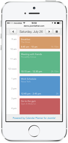
Calendar Planner has been built with responsive layouts, that will adapt to your device screen size. On smartphones, touch events are enabled to allow drag and drop and click.


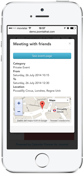
These are real screenshots of Calendar Planner on an iPhone
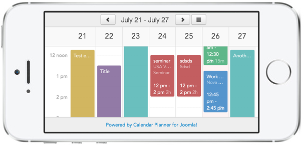
The responsive layouts will not only adapt elements to the screensize for proper view, it will also re-arrange and hide some elements for a better view.
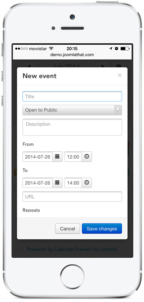
For example, modal windows for events will take the whole screen size. The top bar is minimized and the additional options are hidden under a collapsable menu.

Real screenshots of New Event modal window on an iPhone

Real screenshots of Week view in landscape on an iPhone