Creating your first graphic statistics module
This article is going to guide you to the basic steps for you to create a Content Statistics module to display graphic stats on your site.
This article refers to the module called "Content Statistics (COMPARE IN TIME)", which we also call "Evolution Charts Module", because its purpose is to draw graphic charts for site activities over time. The "X" axis on these module graphics will be always the Time variable (wheter they are days, months or years). The "Y" axis will be whatever type of data you decide to draw in them. You can read more about it here.
The graphic you can produce with this module can look like this:
Set the global module parameters
- After having installed the module, you can proceed to configure and enable it. As with any other Joomla module, you will need to give it a name, set a position for it, publish it, and also assign it to some (or all) module positions.
Set the basic module options (define what you want to draw)
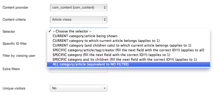
- You can now start configuring how you want the graphic to look like, what you want to show with it. At first sight, you will see a set of basic parameters that you need to take care of:
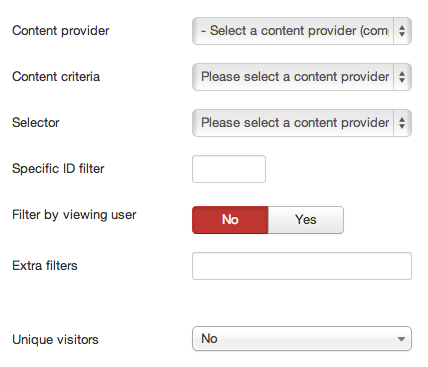
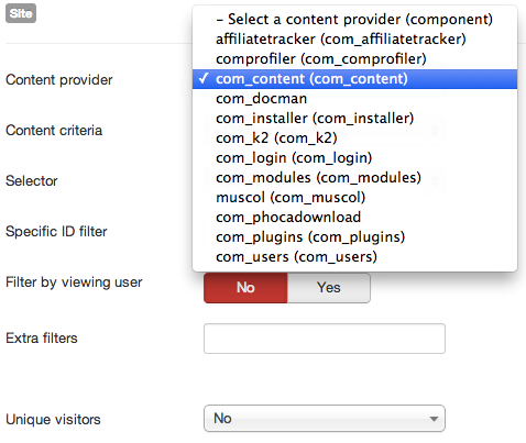
- Content provider refers to the component you want to display information from. This list will display to you all the options available, which are the plugins for Content Statistics you have installed. If you want to display activity information about Joomla articles, then you need to select "com_content". If you want to display activity for K2 component, then select "com_k2".. and so on.
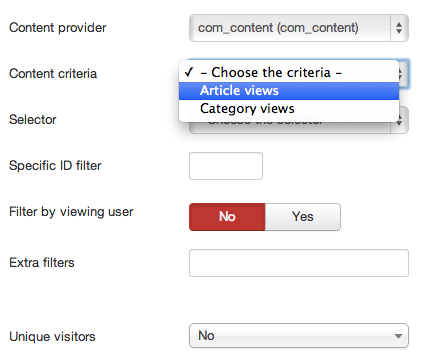
- Content criteria. After you have setted your Content provider, the fiel Content criteria will be populated with the options that this module offers you to draw. These options are already "filtered" to the component you have selected. For example, we decide we want to show "Article views", to see how many hits are receiving the articles in our website.
- Selector: Offers you filtering options for the "content criteria" you have just selected. Sometimes you don't want to draw all the information, but only the information for a certain category, or author, etc. In some cases, for example if you want to filter results by a specific category, you'll be asked to input the category ID (or other IDs) in the "Specific ID filter" field.
- Other secondary settings
- Filter by viewing user: if set to Yes, it will only draw activity that the user who is viewing the graphic did. In other words, it will only display information generated by the logged-in user.
- Extra filters: Some "Content Criteria" can be even more filtered by adding other filtering options. These options, if available, are described in other articles in this section, like extra filters for Zoo articles statistitics.
- Unique visitors: You have the possibility to count "only one hit per user per day", by setting the filter to IP or User ID.
Setting the timespan
Next part you need to adjust is the timespan (the X axis) you want to cover in your graphic. Note that the timespan will always end at "now", while you will be able how much time "back" you want to consider, until "now".
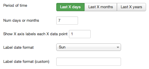
- Period of time: set if you want to display Days, Months or Years in your graphic.
- Number of days or months or years: set how many "units of time" you want to go back. For example, if you set it to 12 months, you will be seeing the last years activity, grouped by months.
- Show X axis labels each X data point: Sometimes, specially if you want to display Day by day charts for a long period of time, there cannot be much space on the X axis to print all the lables, so they can look overlapped and ugly. You can with this parameter set to print only a few labels.
- Label date format: set which date format you want to use for the X axis.
- Label date format (custom): if you know basic PHP date format setting, you can define your own format here.
Setting the graphic options
Now we move to the last important part, which is setting up which visual design you want to give to the graphic: shape, size, color...
- Layout: you can choose between "old" graphic types (which are <IMG> elements in HTML language), or the (recommended) "new" type, which provides interactive graphics. We recommend you to always choose "New" type, as "old" option will be dropped in the future.
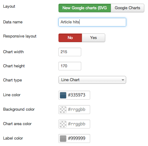
- Data name: give your Y axis points a name.
- Chart width and height: Set the size of the chart, in pixels.
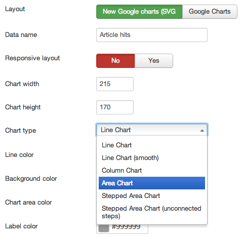
- Chart type: Set which type of chart you want to use
- Line Color: Set the main color to use
- Fill color: only for "old" type of chart. Deprecated.
- Background color: Set a background color for the chart area
- Chart area color: Set a background color for the whole area space
- Label color: the color of the labels
Other settings
You can set other type of graphic settings if you use the Old chart type (not recommended). Will be soon deprecated.
Additional comments
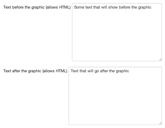
You can use The "Introduction text" fields to display some text or HTML code before and after the chart space.